Remember this tumbler quilt?
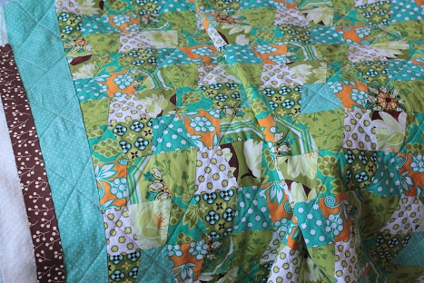
I got it all quilted on my machine, and I’m really happy with how it turned out. I did diagonal straight lines, and with the walking foot it wasn’t too bad at all.
But now I need your help! I just can’t decide if something more neutral like the brown looks better than the bright orange for the binding.
What do you think???
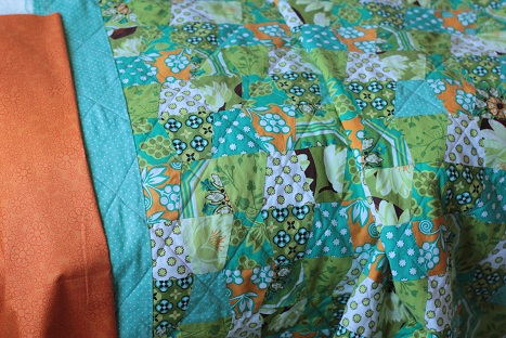
The orange binding would really accentuate the orange throughout the quilt, wouldn’t it?
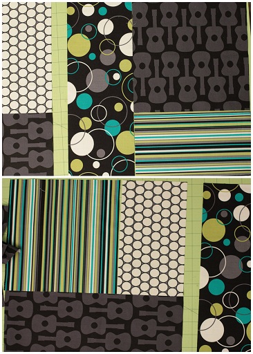
Also, I just got this quilting fabric from Michael Miller to try out. I’m doing a turning 20 design with all these fabrics for my new baby boy, and I LOVE IT. More on that when I’m all finished!
I think I’ll try making Pioneer Woman’s Knock You Naked Brownies today. Yum.
Happy Wednesday!
i like the orange, makes it pop
I vote for the brown, but I think they both look nice!
They both look really nice! But, if I had to pick it would be the brown since it allows the quilt to stand out all by itself.
Yeah…I think I agree with Nemesis and Kathy. I like how the orange contrasts really well, but I don’t necessarily want to bring the orange in the quilt out. So I think I’ll go with brown. Thanks for your help!
Not to throw another ingredient into the pot, but I think a teeny border of orange and then the brown binding would be so neat…!
I like the orange, but I think the brown wouldn’t be bad at all :)
I like the brown!!!! :)
Orange!
I agree with Michelle. A little boarder of orange with a wider boarder of brown would look amazing. Just enough pop to show the orange yet not be distracting from the pattern. It would look sharp!